3 Quick Ways to Create Graphs of Your Class Distributions in Python
Whenever we are building machine learning models we always have to evaluate the data. For classification problems, at the very least, we need to look at the class distributions to see how balanced or unbalanced our training set is. Here are 3 quick ways to use Python to visualize the class distributions (each less than 10 lines of code):
Python Setup Code (so we have data to look at):
import random
import pandas as pd
import numpy as np
import matplotlib.pyplot as plt
# Use the line below to show inline in a notebook
%matplotlib inline

#Generate random integers for class IDs, then find
#the unique ones and their counts
y_values = [random.randint(0,20) for _ in range(101)]
unique, counts = np.unique(y_values, return_counts=True)
y_train = y_values[:80]
y_valid = y_values[81:]
Quick but “Fugly”
pd.DataFrame(unique)[0].hist()
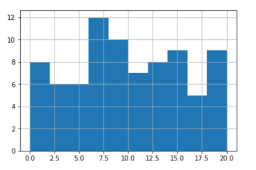
Class distribution graph
Quick and a Little Easier on the Eyes
plt.bar(unique, counts, 1)
plt.title('Class Frequency')
plt.xlabel('Class')
plt.ylabel('Frequency')
plt.show()
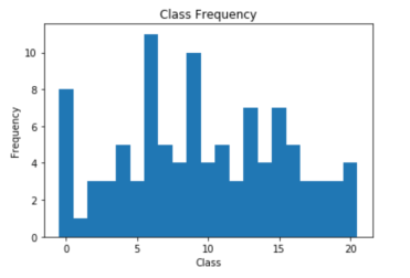
Class distribution graph with labels
Even Better (both training and validation data are shown)
unique, counts = np.unique(y_train, return_counts=True)
plt.bar(unique, counts)
unique, counts = np.unique(y_valid, return_counts=True)
plt.bar(unique, counts)

plt.title('Class Frequency')
plt.xlabel('Class')
plt.ylabel('Frequency')

plt.show()

Class distribution graph – training and validation data
Here are some of my other articles on Pandas.


